There was a time when the internet felt different—when it wasn’t a maze
of dark patterns designed to manipulate your attention, when software
was built for the user, not for the highest bidder. Back then, a browser
was simply a tool, a window to the world, not a marketplace disguised as
an app.
Somewhere along the way, that changed.
Today, browsers are riddled with engagement traps. They
track you, sell your data, shove crypto schemes in your face, and call
it ‘innovation.’ But real innovation isn’t about bloated AI
assistants or endless monetization tricks. Real innovation makes life
simpler, not more exhausting.
I built Zen because I believe the browser should serve you. It should be
fast, transparent, and private by design—not as a checkbox feature, but
as a philosophy. It should get out of your way, so you can get in, do
what you need to do, and step away from the screen without feeling
drained.
I’m not a corporation. I don’t have a marketing team
crafting sleek slogans, nor a boardroom plotting engagement metrics. I’m
just a developer who saw what was wrong and decided to fix it. Zen isn’t
about gimmicks. It’s about respect—for your time, your privacy, and your
right to a better web.
It won’t be perfect, and I won’t
pretend to have all the answers. But with the help of a passionate
community, I know we can build something that matters. A browser that
doesn’t fight against you, but works with you.
There was a browser that kind of did this, Arc.
For a while, it felt like a breath of fresh air: a browser that
challenged conventions, that cared about design, that aimed to make
browsing feel intentional rather than chaotic. It rethought the
interface, introduced thoughtful features, and for a moment, it seemed
like someone finally got it.
But then, things changed.
The Browser Company, Arc's VC-backed creators, became
ambitious, and they decided that their loyal user-base still fell short
of their goals to compete with the big names like Chrome, right from the
start. Thus, they announced that Arc was "good enough" and went off to
work on a new AI-powered browser.
Yet, it wasn't. The
Windows version was a shadow of what was promised—slow, unstable,
missing core features. The MacOS version was in a better state, but
performance and stability gradually degraded with every update. What
started as a vision for a better browser quickly became yet another
company chasing after monetization, pivoting to AI gimmicks and
engagement loops instead of refining the core experience. Thus, Arc was
finished, before it had even reached its real potential.
I won’t pretend Arc didn’t inspire me. It did. There’s a lot to admire
in its design philosophy, in its willingness to rethink how we interact
with the web. But inspiration isn’t imitation. I’m taking the
good—thoughtful UX, a clean interface, a focus on user control—and
cutting out the bad. No forced online accounts. No feature bloat
disguised as innovation. No chasing trends just to stay relevant.
Zen
isn’t about maximizing engagement. It’s about minimizing friction. It’s
about building a browser that works with you, not on you. And beyond
that, I’m exploring my own ideas—rethinking not just how a browser
looks, but how it feels to use. How it fits into your life without
demanding more of your attention than necessary. While it's still in
early development, I'm excited to share it with you, and to hear your
thoughts on how we can make it better together.
So, what's the plan?
Zen is still in its early stages, but it’s growing fast. I’m
working on a roadmap that focuses on the essentials: mantain firefox
updated and secure to gain trust, improve the UI/UX to make it more
intuitive and enjoyable, and implement features that make your life
easier, not more complicated.
Arc's Basic Features
Expand on our own interesting ideas
Final touches, polishing and rebrand for stable release
The future of Zen isn’t set in stone. It’s a work in progress, shaped by
your feedback, your ideas, and your needs. I’m not building this browser
for me. I’m building it for you—for all of us who believe the web can be
better, who want to take back control of our digital lives, and who
refuse to settle for the status quo.
If you’re tired of
browsers that treat you like a product, if you’re looking for a
different way to browse, if you believe in a web that respects your
privacy and your time, then I invite you to join me on this journey.
Let’s build something that matters. Let’s build a browser that respects
you.
I also want to invite you to contribute, if you have any ideas,
suggestions or want to help in any way, feel free to let us know. Some
zen features where completely community driven, implemented by external
contributors. We are always looking for new ideas and ways to improve
the browser.
The internet deserves better.
So do you.
~ mr. m ✌️
From customization to clarity: lessons learned building Zen Browser.
TL;DR
I'm not a design expert, just someone learning through building Zen.
These are personal just thoughts. I hope they spark reflection,
especially for those in the FOSS community. Read with an open mind,
think beyond what I’ve written, and if anything resonates or you
disagree, feel free to reach out. I’d love to talk more and keep on
learning!
Don't worry, don't uninstall Zen inmediatedly. This isn’t about
removing all customization. Zen will always support mods and deeper
tweaks for those who want them, just not at the cost of thoughtful,
opinionated design.
Read, reflect, and enjoy! ‹3
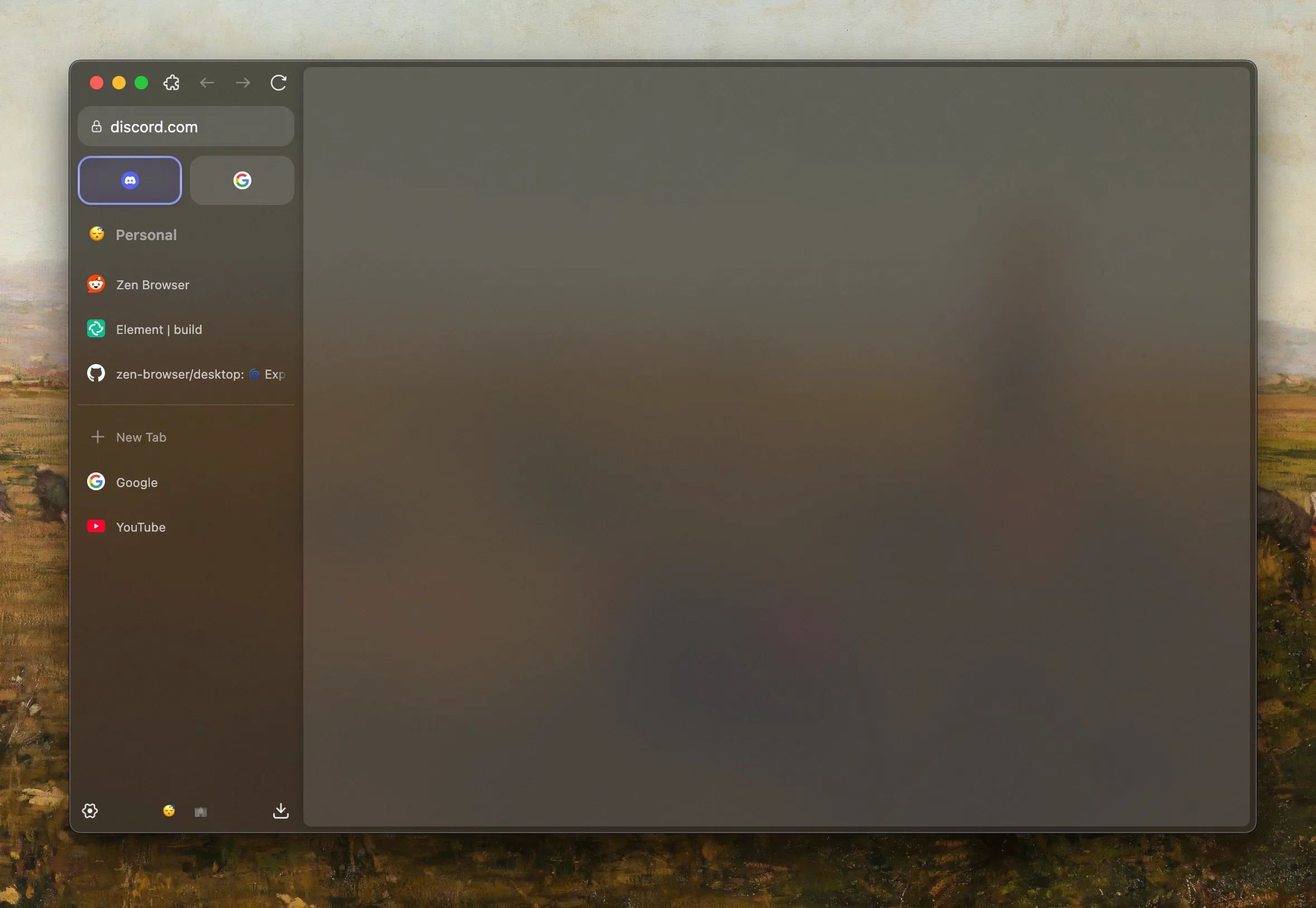
A year ago, I set out to build a browser. Not just any browser, but my
browser. One that would reflect my values, my needs, my ideal vision of
the web. I called it Zen Browser.
Like many developers, I started by dreaming big: total customization,
endless tweaks, and fine-grained control over every pixel. But somewhere
along the way, something changed.
What I found instead was clarity, not in complexity, but in simplicity.
In choosing design that respected the user, instead of overwhelming them
with choices.
The Allure of Customization
There’s something exciting about total freedom. Developers love the idea
of giving users endless choice. It feels democratic. Respectful.
Open.
That’s how I started. Zen Browser was going to be fully moldable. You’d
shape it to your needs, down to the smallest detail.
But what I learned is that more choice doesn’t always mean a better
experience. In fact, it often leads to decision fatigue. Users get lost
in the settings instead of enjoying the product. And many never find a
setup they actually love, they just keep tweaking.
At some point, I realized that no one ever said,
“I love this browser because I spent three hours configuring it.”
They just said, “It works. It feels right.”
The Turning Point
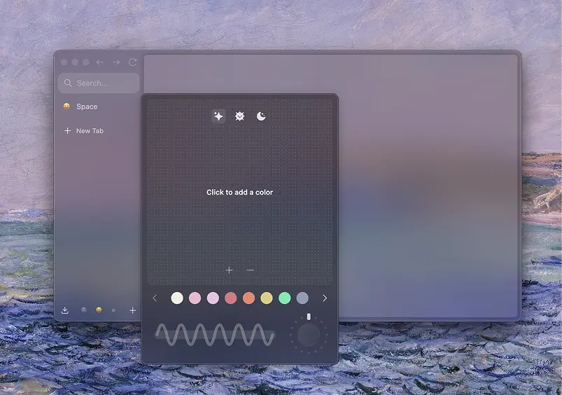
It happened with something as small as a color picker.
Zen Browser's original color picker was incredibly flexible. You could
set any color, rotation, gradient style, it was a playground. Total
freedom. And on paper, it was a win. Users could make their browser look
exactly how they wanted.
But something didn’t sit right. The more I used it, the more I noticed
the results often looked... off. Some color combos clashed. Others
lacked contrast. Gradients looked messy or chaotic. The feature was
powerful, but it didn’t guide anyone. It just gave them tools and walked
away.
That’s when I looked at what Arc did, and I’ll admit, we copied it. (Big shock, I know.)
We removed the rotation. We enforced color harmony. Gradients had to use
complementary or analogous tones. The result? No more wild combinations.
No more chaos. Suddenly, every workspace had colors that just worked.
Gradients that felt designed, not generated.
Not everyone liked the change. People asked why they couldn’t tweak
things the old way. They missed the freedom. But I
didn’t miss it. In fact, I felt proud.
That was my turning point. When I realized I didn’t want to make
something endlessly customizable. I wanted to make something beautiful.
Something that felt finished. Something that didn’t ask to be fixed or
adjusted, it just looked good, because it was designed that way.
That moment, over a simple color picker, defined everything that came
next.
Looking back, it wasn’t just about colors. It was about clarity. I
realized that good design isn’t about offering every option, it’s
about making the right choices so the user doesn’t have to. That shift
changed everything about how I approached Zen.
Finding the Sweet Spot
Total rigidity can be just as limiting as total freedom. The real
challenge, and the real art, is in finding the balance between the
two.
That’s where the idea of sensible defaults, respectful overrides came
in. With Zen, I wanted most users to open the browser and feel like it
was already finished. Clean, quiet, considered. But I also wanted to
leave a door open, discreet, intentional, out of the way, for those who
needed more.
That’s why advanced preferences exist. Hidden settings.
Power-user flags. The kind of features you don’t stumble into, but
deliberately reach for. Like the ability to bring back full gradient
control in the color picker. Or override animation timings. Or adjust
tab behavior beyond the default.
These aren’t features for everyone. They’re escape hatches for those who
know what they want. And keeping them tucked away preserves the core
experience for everyone else.
The sweet spot isn’t compromise. It’s clarity, knowing what your product
stands for, while still leaving space at the edges for people who ask
for more.
What I Learned
This past year didn’t just teach me how to build a browser. It taught me
how to think.
I used to believe that more options made a better product. That users
wanted control above all else. But I’ve learned something deeper, people
don’t open a browser to tweak. They open it to use. And the best
experience is the one that’s already great, before you touch a single
setting.
-
Customization is not a replacement for good design.
If your product only shines when users tweak it, you haven’t
finished it.
-
Defaults matter more than features. Most people never change
settings.
What they see first becomes their entire experience.
-
Good design is opinionated, and that’s okay. You’re
allowed to make decisions on behalf of the user, as long as those
decisions are thoughtful and respectful.
-
Hidden power is better than visible clutter. Give
advanced users what they need, but keep the surface calm and
approachable.
-
Every decision sends a message. Even a toggle
switch tells the user what kind of product they’re dealing with,
precise and focused, or chaotic and unfinished.
Zen Browser got better the moment I stopped trying to please everyone
and started trying to serve someone, someone who wants clarity, not
control. Someone who wants to open their browser and feel calm, not
busy.
A Quiet Conclusion
I’m not a design expert. I didn’t study user experience or typography or
color theory. I’m just someone who built a browser, made a lot of
mistakes, and slowly started to see things differently.
Zen Browser isn’t perfect. It still has rough edges. There are things
I’d change, and things I’m still unsure about. But if there’s one thing
I’ve learned, it’s that
simplicity takes more courage than complexity. It’s
easier to add features than it is to say “this is enough.”
This past year taught me to trust the user, not by handing them the
entire toolbox, but by giving them something they can rely on.
Something that feels considered.
If you're building something of your own, I hope you don’t feel pressure
to make it do everything. Maybe just focus on making it
feel right. Thoughtful defaults. Strong ideas. Gentle
polish. That’s what people remember.
Not the number of settings. Not the sliders or toggles. Just how it made
them feel. That’s the kind of design I’m still learning to do. And I
hope to get better at it, one
release at a time.
So, if you’re building something, remember this:
You don’t have to please everyone. You just have to care deeply about
someone.
Stay safe out there. Build with clarity. And never feel bad for not
pleasing everyone.
~ mr. m ✌️
I've been day-and-night playing around with Arc's color picker in order
to understand how it works, and how I can make it better.
I wanted to share what's the magic behind Zen's color picker, and how it
works behind the scenes because it let me learn a lot about design,
color theory, mathematics, and overall, push myself to learn more about
interesting topics that I never thought I would be interested in!
This blog will be quite long and technical, so I recommend you to
grab a cup of coffee or tea, and sit down to read it. I will try to make
it as interesting as possible, but I can't promise that it will be easy
to read.
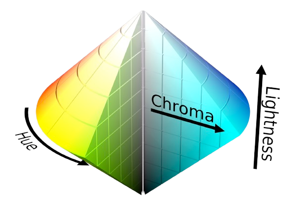
Extracting colors: Part 1 - The HSL color model
Colors are a fascinating topic, and there are many ways to represent
them. The most common way is the RGB color model, which represents
colors as a combination of red, green, and blue. But no, we are not
going to use RGB, we are going to use the HSL color model instead.
HSL is represented as a combination of hue, saturation, and lightness.
Unlike RGB, HSL is formed in a 3D space, making it more interesting to
work with
in a 2D space.
Extracting colors: Part 2 - The HSL color picker
The way colors will be represented in our color picker is by calculating
the position of our dots from the middle of the color picker, to extract
the hue, saturation, and lightness values from the position of the dot.
First, let's start by doing simple calculations around the center of the
color picker, we need to know: the angle from the center to the dot, and
the distance from the center to the dot.
Note: The angle is in degrees, and the distance is in pixels.
Now that we have the distance and angle, we can calculate the hue,
saturation, and lightness values. Please note that the normalized
distance is calculated by subtracting the distance from 1, so that we
get more chromatic colors when the distance is closer to the center, and
more desaturated colors when the distance is closer to the edge of the
color picker.
Displaying colors: Part 1 - Dark mode or light mode?
Now that we have an RGB color after converting the HSL values, we need
to decide whether to use a light or dark mode for the sidebar theme.
This is a very important decision, because since we can go from white to
black in the color picker, we need to decide whether to use a light or
dark mode for the sidebar theme, so that the text is always readable.
The way we do this is by checking the lightness value and deciding what
theme to used based on the contrast from both text colors, and the
background color.
First, we need to calculate the luminance of the background color when
blended with the text color (to simulate text opacity), and then we can
compare the contrast ratios to decide on the theme.
TODO: NOT FINISHED YET

The last few days have been some of the hardest of my life. For the
past 3 days, you had stopped drinking, and every time you managed to
eat something, you would end up vomiting it a day later. I knew
something was wrong, but I kept hoping you would pull through like you
always did.
Then came the call from the vet. The words I never wanted to hear. I
had to make the hardest decision of my life, to say goodbye. My heart
broke in that moment, but I knew it was the right thing for you.
I wanted to take you on one last walk, to feel the breeze and see the
world together one more time. But you couldn't. You made it only about
20 steps outside the house before you just fell on the floor, too weak
to keep going. That was the moment I realized I would never see you
run again, or jump again, or watch your tail swing happily behind you.
The world seemed to stop right then. I sat beside you, holding you,
wishing I could make it all better.
You were my best friend, my family, my comfort through everything.
Thank you for every wag, every cuddle, every happy moment we shared. I
will miss you more than words can ever say.
The next day, the house was so quiet. No soft paws, no gentle
breathing, no tail tapping against the floor. Just silence. It felt
like the world had lost a bit of its warmth without you in it. Every
time I walked into a room, I expected to see you there, looking up at
me with those big, loving eyes. But you weren't. And that hurt more
than I can say.
Rest now, my sweet girl. You'll always be in my heart.
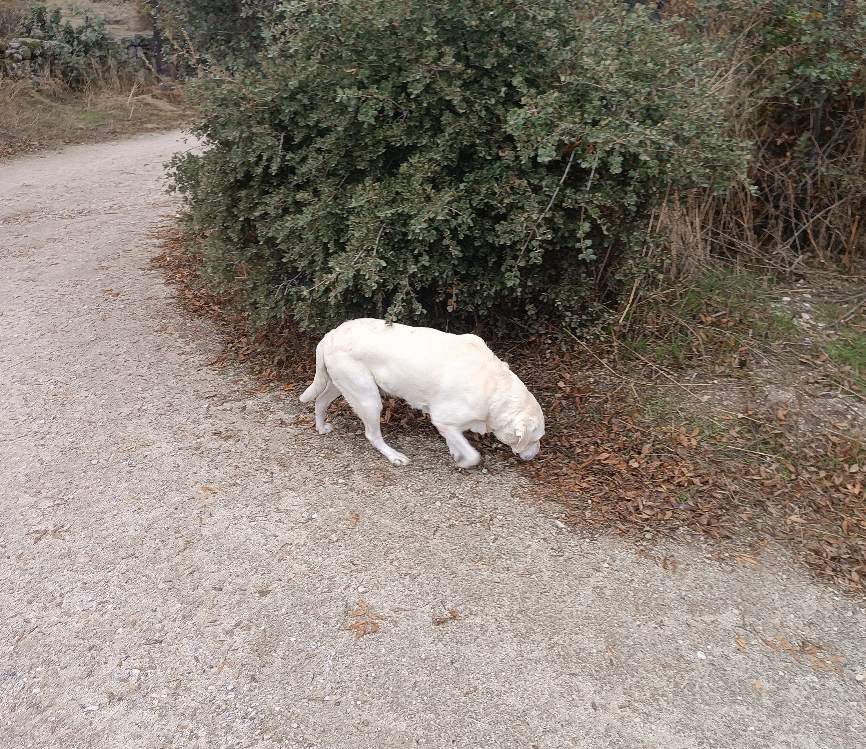 Picture of her last walk, taken just hours before she passed
away.
Picture of her last walk, taken just hours before she passed
away.